A lifetime ago but really, only in 2019, the words “data” and “analysis” were really, only being used in consultancies and high-tech business-strategy workshops. As an energy consultant, I use them all the time. But to my family and friends, this was all mumbo jumbo. Not any longer.
Now, we have all become focused on data and experts for analysis. How many deaths in the UK today? What proportion of the population is going to be hospitalized? What does a particular development translate to how long the lockdowns and restrictions will last? Are the cases in Hong Kong being driven by imported cases or is there local transmission?
For policy makers, data leads to a large numbers of decisions being required about policies to slow the spread of coronavirus. Should schools be shut? How large a “large gathering” of people should be banned? Should the population be told to wear face masks? How many new temporary hospitals are needed? For individuals in places without formal lockdowns, similar questions arise: Should I keep my children home from school? Should I ask all my employees to work from home?
From this pandemic, we have seen that it’s not just the data that’s important, it’s also how that data is presented to make it easy to digest. Some news outlets are leading the way in this while “worldometer” is fantastic for raw data, their charts pale into comparison with what the Financial Times (FT) is doing with the same information.

Source: https://www.worldometers.info/coronavirus/#countries
Worldometer has great facts. But sometimes you just want to see the messages more clearly. A table is great for showing a large number of facts, but if you want an answer to the question “who is managing this pandemic best”, in order to develop good policy, then you need a chart.

Source: https://www.ft.com/coronavirus-latest
FT has a number of such excellent charts and in doing so it creates information from the data. In the chart on the right, we see that by plotting deaths on a log scale since the first three deaths in a country, we can see how many countries follow the same exponential trajectory to start with, and also, how countries vary over time.
We can see the waves of infection rolling around the world and moving from region to region. We can see how in the 2021, vaccinations have made a huge difference in some countries such as UK, while in others (such as India) the pandemic is still exponentially expanding.
A chart such as the one shown earlier allows us to focus on what seemed like the end of the world (March and April 2020) has been eclipsed by events in the same months of 2021. Drilling down into detail on charts like this last year, it was possible to see how massive test and trace programmes in Asia saved lives early in the pandemic and vaccines are the way to do that now. As we move forward key questions remain about how countries with low virus and low vaccination rates will be able to reopen.
LOCALS JOIN IN THE REPORTING
But it’s not just major news organisation that are leading the way. In Hong Kong, we have a local website providing a great deal of facts.

Source: https://wars.vote4.hk/en/cases
Indeed, if you wish to drill into the details of the lives of each patient that has been reported, this is the place to look. But for those more interested in the “bigger picture” questions such as whether HK’s increase in cases in late March 2020 was due to local transmission (a big issue) or imported cases from school and college students from Europe (a manageable issue) — it is not easy to draw this from the very detailed table. However, the data has been taken by an individual, who posts it regularly on a HK website (Geoexpat) under the username CharSuiNow and now we can visualize clearly how many of these cases are local vs imported.
VISUALISATION THROUGH USE OF CHARTS
The chart below shows clearly the difference between data and information. When data is available publicly, individuals and companies can use it to focus on what people are most interested in order to turn “data” into “information”.

VISUALISATION THROUGH USE OF MAPS
Most strikingly, one particular type of visualisation that we have seen more recently is maps. From local maps showing the location of each confirmed and possible case to international maps which show at a glance, the relative severity of the crisis across the globe.
 Source: https://chp-dashboard.geodata.gov.hk/covid-19/en.html
A GLOBAL PERSPECTIVE OF THE COVID-19 OUTBREAK
This crisis has highlighted the need for good data, speedy data collection and importantly the value of how well-presented data turns into information that can be used for good decisions.

Source: https://www.ft.com/coronavirus-latest
USING THE POWER OF VISUALISATION FOR COMMERCE
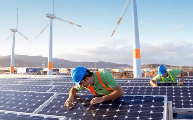
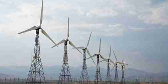
In our own industry, this is something that I have known for a long time and used extensively in my own consulting, which is why I am pleased now to be on the Board of Genesis Ray, a Singapore start-up which is gathering public data on the energy industry and making it available in visually appealing and useful ways.
The company has a strong focus on maps, using them to mark key aspects of energy infrastructure in given area so that decision makers can quickly review and assess whether the area is suitable for a new solar or wind farm.
 Source: Genesis Ray Energy
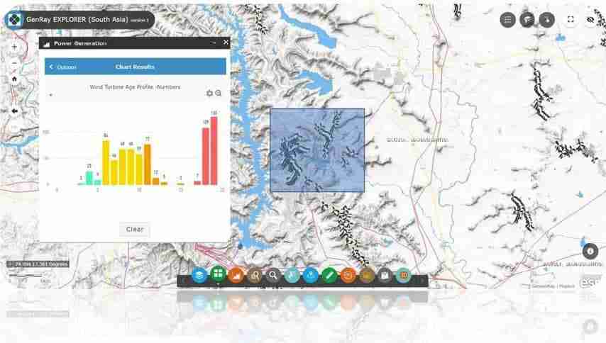
In the following example we can see the value of being able to drill down into detail when the “big picture” looks crowded and find opportunities — in this case highlighting an area where there are a significant number of wind turbines which are more than 15 years old and could be repowered to increase capacity by three or four times.

Source: Genesis Ray Energy
THE POWER OF BIG DATA TO DRIVE DECISION
This need for good data to underpin insight is not limited to pandemics and energy. UBS is also gaining significant traction for world class equity research by using its “Evidence Lab”, a data science division, which was created from the research department to become a separate business within UBS. This employs data scientists and subject matter experts who work with UBS analysts to answer big questions about industries, markets, or the economy at large. In an example set out in risk.com, UBS is using “big data” to understand the economic implications of the pandemic. For example, they use information such as traffic data in China to see how fast China is getting back to work.
Here are a few UBS links that readers may find useful
- https://www.institutionalinvestor.com/article/b1jfg8kkpxk39s/What-Does-World- Class-Equity-Research-Look-Like
- https://www.risk.net/awards/7190036/research-house-of-the-year-ubs
- https://www.risk.net/investing/7490746/alt-data-lends-a-different-light-to- coronavirus-impact
SUMMARY
In summary, data alone is not enough, good data needs to be presented in a way that enables one to visualize additional information and then be used by experts to convert that data, information and expertise into good decisions. These decisions could be good health policy decisions; energy investment decisions or equity purchases.
“This pandemic has changed our way of life: it has highlighted the need for companies that provide good data visualisation and undertake good analysis based on the data. Perhaps some good will come out of the misery.”